The table below shows the age distribution of hypothetical population.
Present this information in the form of a pie chart. Show your workings clearly.
| Age | No. of people (million) |
| Under 20 | 20.90 |
| 20 - 29 | 13.75 |
| 30 - 59 | 12.10 |
| 60 and above | 8/25 |
| Total | 55.00 |
Present this information in the form of a pie chart. Show your workings clearly.
Take Free Practice Test On 2026 JAMB UTME, Post UTME, WAEC SSCE, GCE, NECO SSCE
Correct Answer: Option n
Explanation:
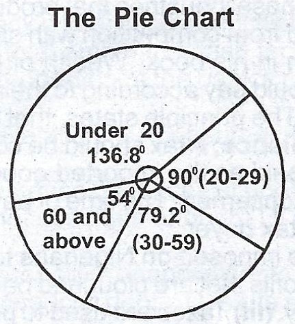
Under 20 =\(\frac{20.90}{55} \times \frac{360°}{1} = 136.8°
Age 20 - 29
= \(\frac{13.75}{55} \times \frac{360°}{1} = 90°
Age 30 - 59
= \(\frac{12.10}{55} \times \frac{360°}{1} = 79.2°
Age 60 and above = \(\frac{8. 25}{55} \times {360°}{1} = 54°
Under 20 =\(\frac{20.90}{55} \times \frac{360°}{1} = 136.8°
Age 20 - 29
= \(\frac{13.75}{55} \times \frac{360°}{1} = 90°
Age 30 - 59
= \(\frac{12.10}{55} \times \frac{360°}{1} = 79.2°
Age 60 and above = \(\frac{8. 25}{55} \times {360°}{1} = 54°